Photography has been a hobby of mine for a few years now. I enjoy getting out in the world and trying to capture something of it. Usually I share the results with friends/family, or if I feel particularly good about how one turned out then 500px. For a while, I have meant to share them here as well, but I never could get around to integrating any sort of gallery functionality.
Well, I finally have gotten around to it. Check it out.
I went through a number of iterations to reach something I am happy enough with, and figure some of it might be of interest. I am no web developer — that is a whole world of tools and tech that I only occasionally make a foray into. I spend my days a bit lower down on the stack, investigating GPU performance. Adventures like "Can haz instruction cache?", "Spot the missing barrier", "What's wrong with the descriptor?" and "Can I hoist this texture load?" are perennial favorites. So this was the "web-naive systems guy's" journey to a functional image gallery.
To start off with, my blog is statically generated using Jekyll. So, creating a gallery page is initially as easy as creating a new "gallery" layout that iterates over some set of images, embedding thumbnails of them in a page with links to the full version. Something like:
{% for image in gallery.images %}
    <a href="{{ gallery.folder }}/{{ image.url }}">
        <img src="{{ gallery.folder }}/{{ image.thumb }}" />
    </a>
{% endfor %}
Where gallery is pulled from a YAML data file. I use a simple script to scan a target directory, automatically generating/updating the YAML as well as thumbnail images.
So far, so easy. This gets us something like this:
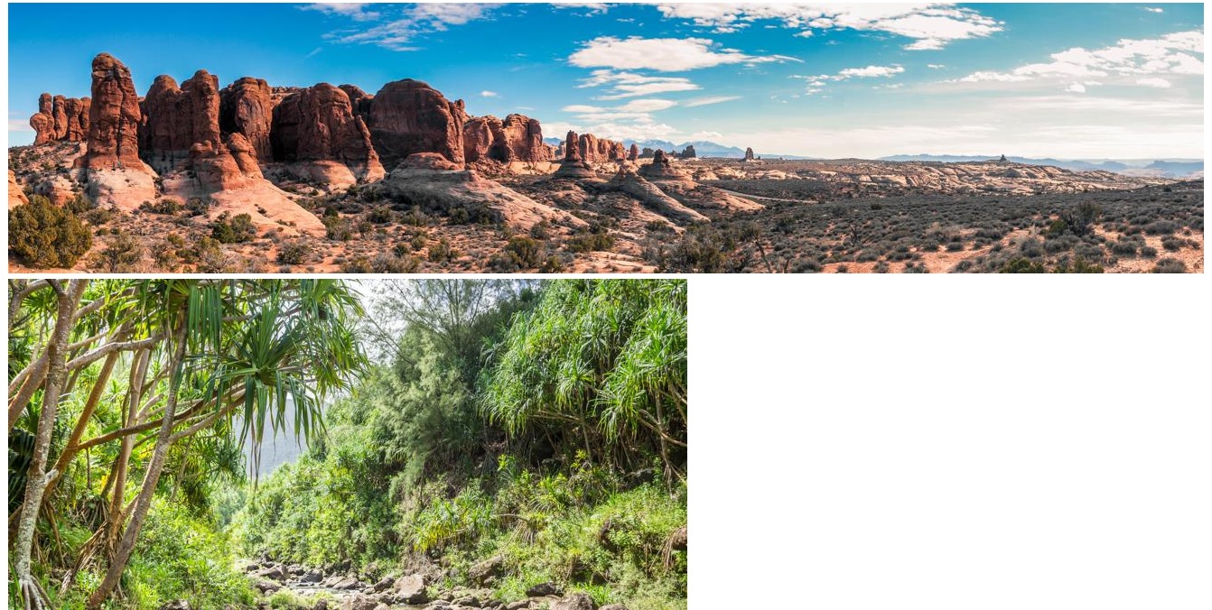
Which is... something. It works at least.
At this point, wanting to make something that looks a little better, probably the right thing to do is just grab any of the pre-baked packages for doing this off of the web. Setting up an image gallery isn't exactly breaking new ground, and there are tons of libraries out there that make this a snap.
Indeed, that is pretty much what I initially did. I grabbed Justified Gallery, copied and pasted a little js into the page to initialize the library:
$("#gallery").justifiedGallery({
    rowHeight: 300,
    margins: 4
});
And voila — instantly, something that looks much better, and very easily done. Justified works great, a number of websites use it (including 500px). No real complaints.
Of course, there is a "but" coming, which is — using Justified Gallery means pulling in its 19KB of minified js and also means pulling in the 71KB of minified, slimmed down jQuery. Tiny in the scheme of things really, certainly nothing compared to the data needed for the actual images, but still it feels (to me) like a lot of code to need to line up some images.
Well, okay, mostly I like to fiddle with things.
So, following the lead of Justified Gallery, what I want to do, roughly, is layout a bunch of images one after another in rows of somewhat equal height, and have them stretch out or shrink as necessary so that the images fill out the width of the row. In other words, "justify" the images like one would justify a paragraph of text. I could of course write some javascript to do this, but I was curious how far CSS could take me. I explored two solutions for accomplishing this — one based around a flexbox layout, and one based around a grid layout.
Quick caveat on all of this — I really don't care how any of this looks on Internet Explorer, or even moderately older versions of other broswers; I'm not interested in trying to support them, I don't test them, YMMV etc. etc.
There are a million different css flexbox guides out there, more than a few of which will do a better job going over it than I would. So rather than do that, I'm just gonna go ahead and walk through a couple iterations of this. I started off with this:
<div class="gallery">
{% for image in gallery.images %}
<a href="{{ gallery.folder }}/{{ image.url }}">
<img src="{{ gallery.folder }}/{{ image.thumb }}" />
</a>
{% endfor %}
</div>
<style>
.gallery {
display: flex;
flex-wrap: wrap;
justify-content: space-between;
}
.gallery > a {
flex-grow: 1;
flex-basis: 300px;
margin: 2px;
}
.gallery > a > img {
display: block;
width: 100%;
height: 100%;
object-fit: cover;
}
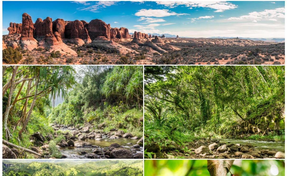
</style>This works pretty well, giving me basically a grid of images, with mostly everything sized the same.
However, notice that first image from Arches National Park — it is supposed to be a panorama. While the thumb works out pretty nicely still (thanks to the "object-fit: cover"), one of the nice things the Justified script does is maintain the natural aspect ratio of the image a little better; that is, a panorama will stretch out nicely, taking up more space, and more vertically oriented images will shrink down to take up less space horizontally.
This can be easily remedied by adjusting the "flex-basis" property for these images based on their aspect ratio. I could of course do this in a script that iterates over all the images and adjusts it based on their actual width. Or, since this is all statically generated, I can just set it at site build time:
<div class="gallery">
{% for image in gallery.images %}
    <a href="{{ gallery.folder }}/{{ image.url }}" style="flex-basis: {{ image.thumb_w | times: 300 | divided_by: image.thumb_h | round }}px">
        <img src="{{ gallery.folder }}/{{ image.thumb }}" />
    </a>
{% endfor %}
</div>
Weee, that was easier even then adding in some javascript to do it. The "{{ image.thumb_w | times: 300 | divided_by: image.thumb_h | round }}px" bit is Jekyll speak for "(w/h) * 300" — i.e. set the width based off the thumbnail aspect ratio and targeting a thumbnail height of 300.
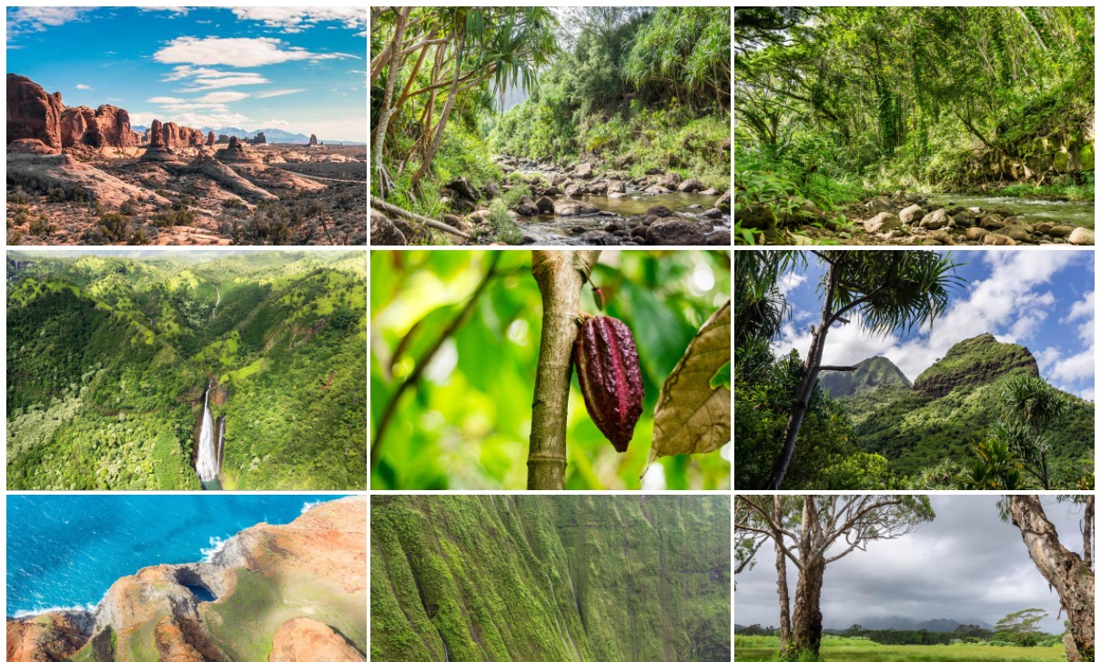
And voila, with just a few lines of CSS I end up with something basically identical to what the Justified Gallery script produces:
So, mission accomplished, job done, nothing more to see right? Well... I am a fiddler...
This all works, but I wanted to try and accomplish something with a little more visual pizzazz. Maybe my css-fu is lacking, but I couldn't really see a way to get what I wanted by using flexbox. Basically, what I wanted is for the occasional thumbnail to be a little larger and more attention grabbing, breaking up the grid pattern a little bit more.
Funny enough, I accomplished by moving away from flexbox and using a css grid layout. With a grid layout, everything gets placed in and sized according to the grid cells, so you might think I'd just end up with another basic grid like in the original flexbox layout. There are a few parts to making this work a little more interestingly.
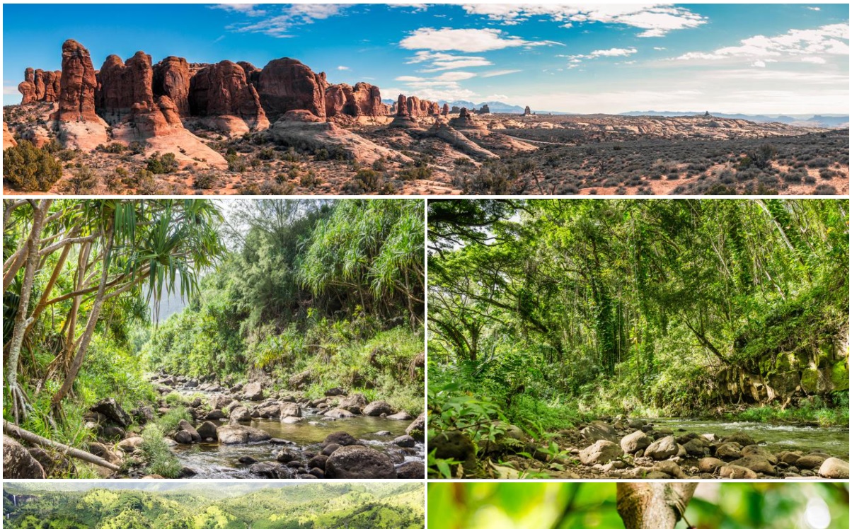
First, I designated a few different basic image aspect ratios (e.g. "1_to_3") and assign each image one of the designations - this is done by the aforementioned script that is responsible for generating the gallery metadata. Using this classification, I create a few different CSS classes that each specify a different grid-row/column span. Of course, now with images all different sizes, it is easy to get gaps in the layout, so the next thing I do is to use the "dense" value for the "grid-auto-flow" property. This will re-order the images to pack everything together - it does mean that images aren't necessarily displayed in order, but that doesn't matter to me. Finally, for a little extra variety, I alternate the row sizes of the grid. Putting it altogether, you get something like this:
<div class="gallery">
{% for gallery in site.data.galleries %}
{% for image in gallery.images %}
    <a href="{{ gallery.folder }}/{{ image.url }}" class="thumb-{{ image.class }}">
        <img src="{{ gallery.folder }}/{{ image.thumb }}" alt="{{ image.text }}" />
    </a>
{% endfor %}
{% endfor %}
</div>

<style>
.gallery {
    display: grid;
    grid-template-columns: repeat(auto-fill, minmax(200px, 1fr));
    grid-auto-rows: 250px 150px;
    grid-auto-flow: dense;
    grid-gap: 4px;
}

.gallery > a > img {
    width: 100%;
    height: 100%;
    object-fit: cover;
}

.gallery > .thumb-normal:nth-of-type(3n) {
    grid-column: span 2;
    grid-row: span 2;
}

.gallery > .thumb-2_to_1 {
    grid-column: span 2;
    grid-row: span 1;
}

.gallery > .thumb-3_to_1 {
    grid-column: span 3;
    grid-row: span 1;
}

.gallery > .thumb-1_to_2 {
    grid-column: span 1;
    grid-row: span 2;
}

.gallery > .thumb-1_to_3 {
    grid-column: span 1;
    grid-row: span 3;
}
</style>
And that's basically it. Some pre-processing during the Jekyll build step and a few lines of CSS and I get something that works pretty nicely. At least on recent versions of all the major browsers - Chrome, Firefox, Edge, Safari. Internet Explorer doesn't look so hot, but, eh, I can live with that.